roos-fs tasks #794
open
(PROJECT) Planned vs Executed Services Weekly Graph
0%
Description
General
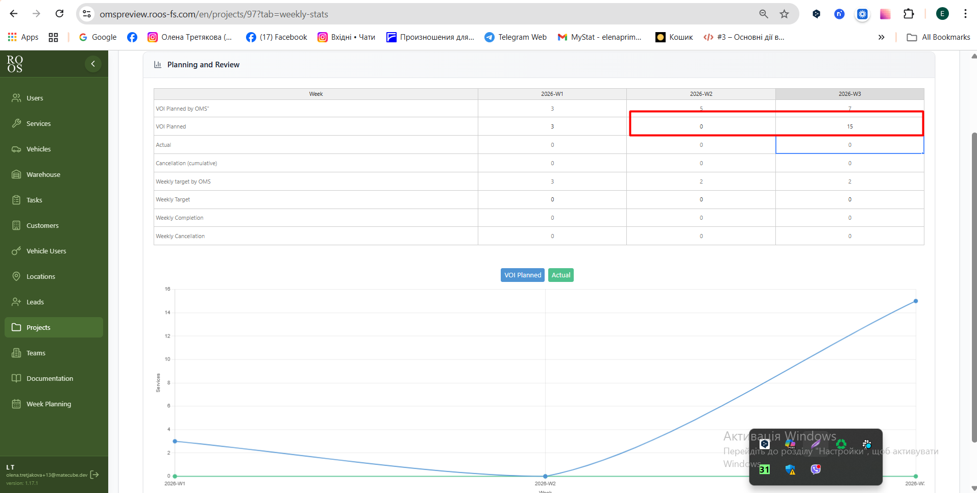
We need to create a simple graph and table that compare planned services per week with executed (completed) services per week.
Planned services calculation:
In general there are 3 logical types of data:
- Manual entered data (Yellow)
- Deafault calculation data (red)
- Actual data (Grey)
Manual entered data (Yellow)
The system should allow the user to set the planned amount of services in two points
- Volume of done services expected in by the week (see highloighed with yellow in the file)
- Volume of expected planned services per week (see highloighed with yellow in the file)
Deafault calculation data (red)
- Volume of services expected in by the week (see highloighed with red in the file) - this is calculated simply by taking the total amount of order deviding them by the amount of weeks and providing the progression of what is expected to be finished by the end week.
- Volume of expected planned services per week (see highloighed with yellow in the file) this is calculated simply by taking the total amount of order deviding them by the amount of weeks and shown what is the expected amount of services needs to be finished in order to be on time till the end of the project)
Actual data (Grey)
- Actual volume (cumulutive) - here we just state how many services are completed by this week (based on the system data)
- Actual volume (weekly) - here we just state how many services are completed in this week (based on the system data)
It is clealy stated how many services are still not planned.
Executed services calculation:
For each week, count how many services were actually completed.
Graph requirements:
Two lines:
Both are using the manual entries
Planned services per week
Executed services per week
The X-axis is weeks.
Y-axis amount of services.
See example from the customer attached.
Status indicator:
A small indicator (with colorcode)should show whether the project is:
On schedule
Ahead of schedule
Behind schedule
Other requirements:
- reuser the designs from this page, especially the grath https://omspreview.roos-fs.com/statistics
- make sure taht design is consistent
- the feature and overview is awailable on the single project overview page
- New tab in the project overview under the name "Controlling"
Files
 Updated by
  Updated by
  Updated by
  Updated by Olena Tretjakova
  Updated by
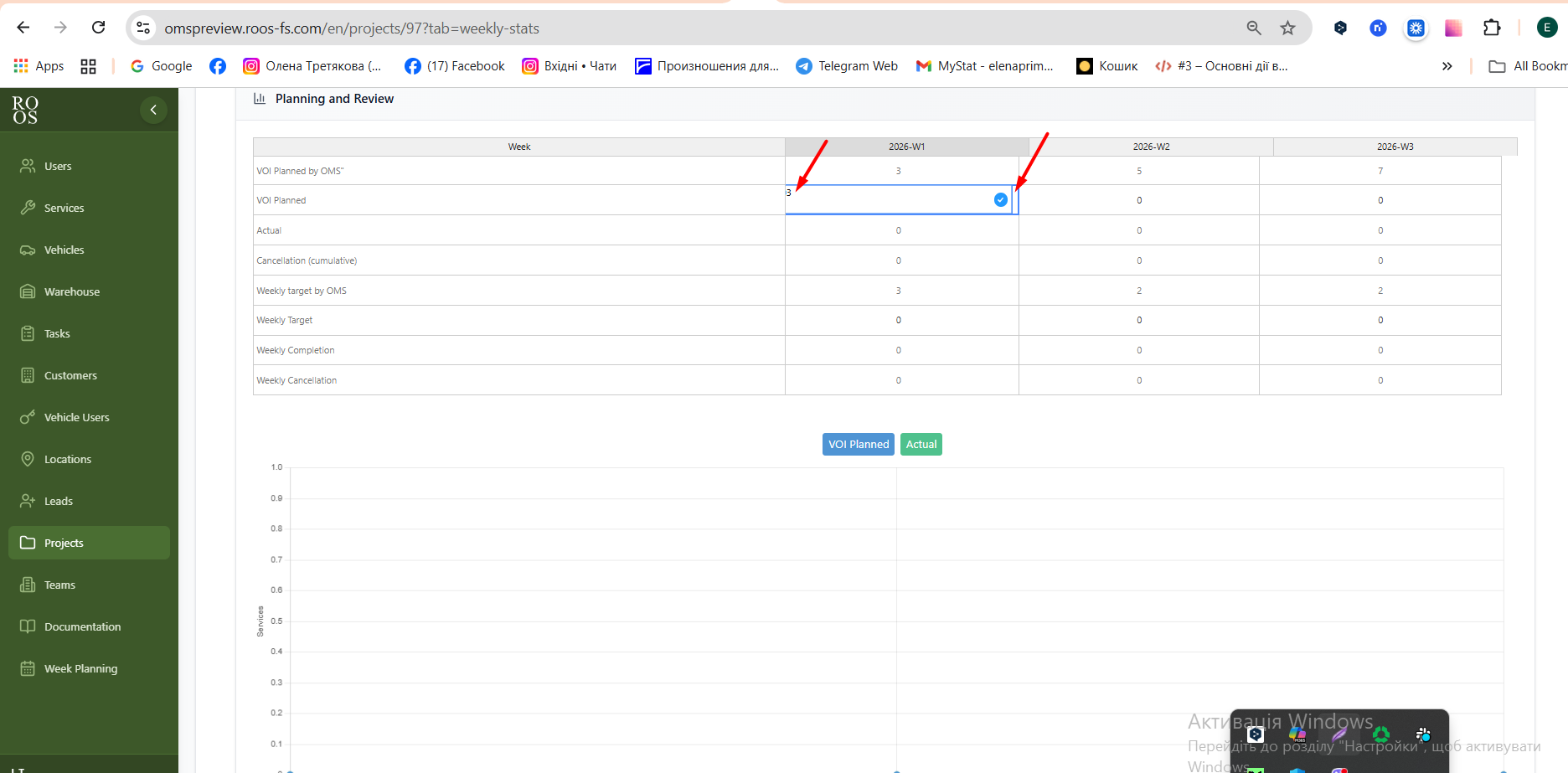